Weitere abgeschlossene Logo Wettbewerbe:
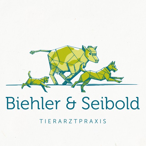 Tierarztpraxis für Nutztiere sucht hochwertiges modernes Design"
Tierarztpraxis sucht hochwertiges, modernes Logo-Design, aber trotzdem klassisch-zeitlos;
Hauptsächlich behandelte Tierarten sollten mit abgebildet/schematisch dargestellt sein (Kuh, Hund, Katze);
Tiere gerne in Bewegung, schwungvoll dargestellt;
nicht Cartoon-mäßig, kindlich oder süß-verspie..
182
Entwürfe
600,00€
Preisgeld
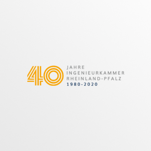 Logo-Design für Jubiläum der Ingenieurkammer"
Wir feiern im Jahr 2020 unser 40-jähriges Bestehen. Aus diesem Grund benötigen wir, neben unserem bereits bestehenden Logo, ein zusätzliches Jubiläumslogo. Unser Name 'Ingenieurkammer Rheinland Pfalz' sollte verwendet werden und '40 Jahre' muss ebenfalls im Logo vorkommen, das Datum '1980 - 20..
40
Entwürfe
320,00€
Preisgeld
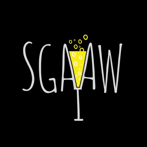 Alkoholfreier Wein sucht freches, hippes Logo"
Das Logo ist eine Abkürzung - SGAAW: schäumendes Getränk aus alkoholfreiem Wein.
Soll geeignet für Sektflaschenetikettendesign sein. Prägnant, hip und vielleicht ein bisschen frech. Soll unter Umständen mit einem traditionsreichen (altbackenen) Weinkellerei Weinkönig Logo kombinierbar sein..
89
Entwürfe
400,00€
Preisgeld
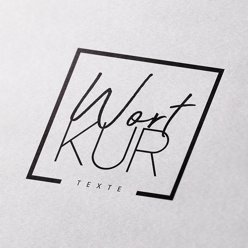 Logo-Design für freiberufliche Texterin (Gesundheitswesen)"
Generell bin ich für Vorschläge in alle Richtungen offen. Zentral ist sicher der Name (wortkur) selbst, der durch die Schriftart und Setzung gut zur Geltung kommen sollte.
Wortkur als Konzept (meine Arbeit als Kur für Wörter/Texte der Kunden) soll später auch im Konzept der Homepage und me..
127
Entwürfe
320,00€
Preisgeld
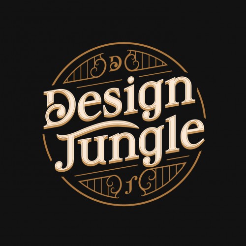 Logo-Design DESIGN JUNGLE"
Logo Style:
Vintage, Art Deco, Emblem, Muster, Hintergrund,
wenig Farben (max. 3) , gut leserlich, Künstlerisch, Kalligraphie
Hintergrund:
Muster
Linien
Art Deco Style
Emblem
Versteckte Icons
Kunstwerk
Da es um Jungle geht können Symbole oder Icons auch im Hintergrund auftauchen:
Ein A..
26
Entwürfe
170,00€
Preisgeld
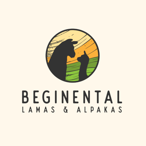 Logo-Design für kleine Hobbyzucht"
Unser Logo soll sowohl ein Lama, als auch ein Alpaka beinhalten. Ggf. lässt sich ein Buchstabe unseres Namens wie ein Lama bzw. Alpaka gestalten (b oder l). Muss aber nicht sein (der Name hat keine Priorität!)
Das Logo sollte als Vectorgrafik zur Verfügung gestellt werden, damit es sich für P..
113
Entwürfe
400,00€
Preisgeld

 Zurück